My computer’s resolution suddenly got screwed up, and despite looking at a number of tutorials, nothing has been working, so I can’t do much of anything with digital art rn 😭
Hopefully I can get my art stuff set up on my dad’s computer soonish…
I never knew why Tumblr’s photo quality is always so much worse until you click on the pic (please click on it it looks so much better) …
Anywho,
greens fanart for mth. A certain scene from a certain “beach episode”. I
found out that making starry sky backgrounds is fun :3 I got a little
lazy toward the end (especially with the surfboards)… but I’m mostly satisfied
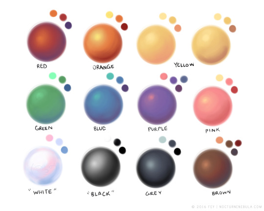
hey yall its me the Art Mom™ to help you shade pretty
rule 1: DO NOT SHADE WITH BLACK. EVER. IT NEVER LOOKS GOOD.
red– shade with a slightly darker shade of purple
orange– slightly darker and more saturated shade of red
yellow– i think like..a peach could work but make it a really light peach
green– shade with darker and less saturated shade of blue or teal
blue– shade with purple
purple– a shade thats darker than the purple you’re using and maybe a little pink (MAYBE blue)
pink– darker shade of red
white– a really light lavender or blue..or i guess any really light colour??
black– okay listen dont use pure black to colour anything unless you want to leave it with flat colours because you cant really shade black lol
grey– a slightly darker shade of purple or blue (less saturated)
brown– slightly darker and less saturated shade of purple or red
aaaaand thats all i got lol. let me know if there is anything i should add to this list!!
If you’re a visual learner…
I made some Balls of Colour to go with Art Mom™’s post:
Ooh also! If you’re using oil paints or pastels, etc, adding the complimentary color when you shade will give it more depth and make it pop. Adding a darker blue to your chosen pigment also helps to get shadows, and are more effective for things in the background or that you don’t want to be the “star” of the piece.


 Disheveled Mess