Check me out in the latest episode of BaM Animation!
I’ve worked in many roles in the industry, but color styling is one of my favorites. It’s also one of the lesser known & more misunderstood roles, so this episode should shed some light on it!
I mentioned on twitter that I wanted to do a lip sync tutorial and immediately got some people who were interested so I put one together real quick!
I’m going to use a bit of unfinished lip sync from my taz animated part as reference. They’re just gifs so no sound, but you should still be able to tell that he’s saying “I’d say a solid B… Solid B minus.”
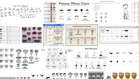
Anyone who’s looked up how to do lip sync has seen phoneme charts. Phonemes are just the shape your mouth makes when you make certain sounds.
When you do lip sync, you want some kind of reference to make sure it’s right
What’s easiest is to say it yourself and pay attention to the shapes your mouth is making. Since you’re going frame by frame, your audio is slow enough that you can make each shape slowly and distinctly and you can get each individual phoneme down in the animation.
Don’t do this.^
An easy way to tell if you’re animating lip sync wrong is if you run out of frames to make each shape. You don’t need them! Making each shape is unnatural. People talk quickly and the mouth doesn’t have the time to get into each shape. They blend together, sometimes to the point where the shape doesn’t change at all!
Not only does the 2nd gif take less frames and energy to make, it’s more relaxed, it looks less distracting, and his lips are much easier to read!
These are reference charts to show the differences more clearly
This is the difference between getting swallowed up in every last detail and paying attention to reality.
What matters more than hitting every syllable is making it look natural and flow with the acting. That’s why anime mouth flaps can work so well. A strong pose through the whole body matters more than one mouth shape.
ALRIGHT SO my pal @kalreyno wanted help with drawing fat characters and as a fat artist i felt like i could give a bit of helpful insight on that. there’s also been a lot of complaining about “boo hoo fat characters are hard to draw so i can’t include them in my work Ever” goin on lately so if that’s your case then this is for you too!! and also just for anyone who would like help with fat bodies in general, ofc. anyway, let’s get this show on the road!!
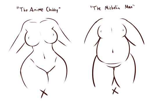
let’s start with some common misconceptions. these are the two main attempts at chubby bodies i run into, so i’ll focus on them.
the Anime Chubby i see everywhere, and it’s just……so wrong in many ways. first of all, there is almost no additional body fat compared to your average thin character – except for where it’s added in “attractive” places (breasts, hips, thighs). the breasts are way too perky, and don’t have the realistic shape fat would give them (though how to draw accurate breasts is another tutorial all on its own lmao). there is still a thigh gap, which usually only happens in very thin people, and bones are still visible on the surface of the skin, which also rarely happens in fat people.
the Michelin Man is better in some ways, but still not that great. it’s a slightly better attempt, but basically all that’s done there is taking a thin character and blowing them up, while giving no thought to fat distribution. the thigh gap is usually still present, and they look a lot more hard than soft – and fat is very soft and pliable.
here’s a chart on how fat usually distributes (if you can’t read my messy writing, “1. next to no fat, 2. moderate amount, 3. most of the fat distribution”). basically, the more muscle an area has, the more prone it is to develop fat, such as the abdomen, thighs, and upper arms. it’s important to note that fat sits on top of muscle, and that it does distribute in different levels, and not evenly across the body as shown in the Michelin Man.
now, here’s an accurate fat body with all of that kept in mind!! notice how the fat isn’t only kept to aesthetically pleasing areas, and how it sits realistically on the character’s body. their breasts sag a lot more, which happens even in thin people with larger breasts, and the nipples are pointing more downwards than straight out. there is no thigh gap in sight, there are no bones in sight, and most importantly, they have fat rolls, which are very important in drawing a convincing fat character!! as far as i know i’ve never met a single person with no rolls at all, and everyone has them, whether thin or fat – they’re just more prominent and more consistently present in fat people. pay close attention to where they are and how they’re shaped.
here are a couple of drawings showing how fat is affected when sitting vs stretching. as seen in the first, the fat specifically on the stomach is distributed a lot more evenly and stretched out, so it becomes “flatter”. the love handles are still pretty visible, though, as well as the fat on the thighs and arms. the breasts are raised with the shoulders, and the fat on the shoulders and near the neck forms rolls as it’s being pushed together.
in the second, there is a lot less room for distribution, so the fat is all pushed together. the breasts sag and the stomach forms rolls and spills into the lap. a good analogy for the way fat works is to liken it to a water balloon, and thinking of how its shape would change when resting flat on a surface, hanging off of a ledge, held upright, etc.
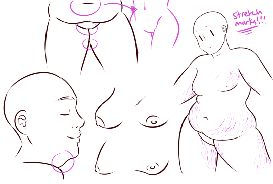
here are a few extra tips i find a lot of people miss!
first on the top is the hip/pubic region. the first circle is showing the way the bellybutton is folded in fat people, as opposed to stretched out in thinner people. the second is the stomach fat spilling over onto the pubic region and creating a separation in the two areas, which is something that’s missing in a lot of art. in addition, the pubic mound also gains fat, making it round as seen in the profile drawing i did up there
(i’ve heard people refer to it as fupa?). the last in the hip region is the lack of a thigh gap. i can’t stress this enough!!!! if you’re trying to draw a convincing fat character, make sure their thighs are pretty much always touching!! for reference, mine literally don’t separate until my feet are about 2ft from each other.
the bottom right is showing the double chin, which a lot of people are afraid to draw!! fat does distribute itself here too, and there’s nothing wrong with it, so don’t feel like you shouldn’t give fat characters a double chin in your work for fear of it looking like a caricature.
in the bottom middle, it’s showing how fat affects different types of breasts with the presence of more or less breast tissue.
lastly, at the very right are stretch marks with their usual locations and directions, which i also can’t stress enough!!!!! i sometimes forget to add them honestly, but they’re so important in accurately portraying fat characters, as they literally come from the skin being stretched from fat being gained (and they’re also just rlly neat lookin like why wouldn’t you lmao). some people have less and some people have more, feel free to experiment with them!
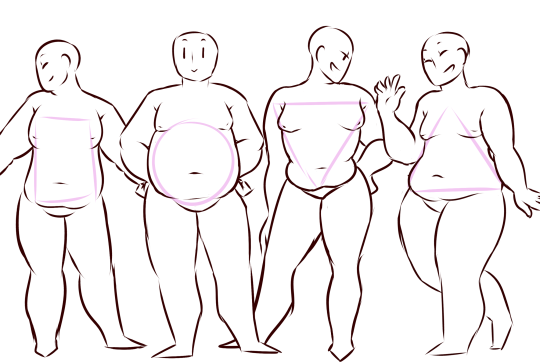
the last thing is body types!! there isn’t one single way for a person to be fat, so feel free to experiment with shapes once you’ve learned the basics!!
so there you have it, a tutorial on how to draw chubs!! now go forth and make some accurate fanart or some rad fat characters, because the world could always use more of both. hmu if you have any questions or concerns, and thanks for reading!!
EDIT: someone pointed out the bad wording in the tutorial. thank you for bringing it to my attention and sorry for offending anybody. i’ve updated the tut, so please reblog this one!
Natural Black Hair Tutorial! Usually Black hair is excluded in the hair tutorials which I have seen so I have gone through it in depth because it’s really not enough to tell someone simply, “Black hair is really curly, draw it really curly.”
The next part of Black Hair In Depth will feature styles and ideas for designing characters and I will release it around February. If you would like to see certain styles, please shoot me a message!
YES! BOOSTINGGGG FOR MY FOLKS WHO WANNA/NEED TO KNOW HOW